Oct 4th, 2007
Context vs. Consistency
The context versus consistency debate is not new, but it certainly doesn’t appear to be over. 37signals adds another argument to the context pile…

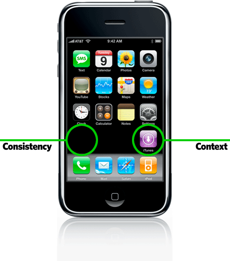
I read this interesting (short) article on 37signals.com concerning Apple’s placement of their new iTunes icon on the iPhone home screen. Given that the western world reads from left to right, users would expect this last icon to appear on the left side, right?… Not so says Apple, here’s why:
Read Context over Consistency at 37signals.com.
Although it’s something that the common person might not notice or ‘get’, it shows that the Apple UI folks are never asleep at the wheel and that they spend time thinking about the small details and their resulting implications. Don’t just do things automatically because tradition says we should or because the technology says it should be that way.
Web favorites
- Casino Europei On Line
- Casino Sites Not On Gamstop
- Gambling Sites Not On Gamstop
- Betting Sites UK
- Casino Not On Gamstop
- Casinos Not On Gamstop
- Best Online Casino Canada
- Non Gamstop Casino Sites UK
- Sites Not On Gamstop
- Non Gamstop Casinos UK
- Non Gamstop Casinos
- Slots Not On Gamstop
- Best Non Gamstop Casinos
- UK Casino Not On Gamstop
- Gambling Sites Not On Gamstop
- Slots Not On Gamstop
- Non Gamstop Casinos UK
- Meilleur Casino En Ligne France
- Beste Online Casino Nederland
- Best Non Gamstop Casinos
- Non Gamstop Casino
- Betting Sites UK
- Casino Non Aams Italia
- Casino Online Non Aams
- UK Casino Not On Gamstop
- Casino Online
- Casino En Ligne Belgique
- Meilleur Site De Casino En Ligne Belgique
- Siti Scommesse Non Aams
- 파워볼사이트
- オンラインカジノ ライブ
- плинко
- Cresus Casino Interdit En France
- Casino En Ligne Fiable
- Siti Di Scommesse Non Aams
- 仮想通貨カジノ おすすめ
- Casino En Ligne France
- Casino En Ligne Français
- Casino Non Aams
- Bonus Casino En Ligne
- Bonus Casino En Ligne
One Response to “Context vs. Consistency”
Leave a Reply
You must be logged in to post a comment.

CBS Mobile is LOOKING for Mobile UI Designers! We need to create amazing graphical mobile designs for Iphone, Pre, Android, and more. If YOU know of anyone who would be interested in a position at CBS, please contact me at [email protected]