Punchcut recently participated in a panel on Mobile Design Best Practices at Mobile Monday Silicon Valley alongside design representatives from Nokia, RIM, Google and Microsoft. The 45 minute session touched on numerous topics including accessibility, redundancy, voice UI, cost of UI design, app features, and differentiation.
Panel moderator Derek Kerton of the Kerton Group asked each participant to prepare a list of our top 5-10 best practices of mobile design. However due to the flow of the evening, we never formally shared our list, so here it is. These were the things that came top of mind to share with Mobile Monday attendees.
1. Relationships matter when everything is connected.
2. Great experiences come from specialists.
3. Create spaces people care about.
4. Focus on the Minimal Viable Product.
5. Create experiences that users want, not what they ask for.
6. Fail early and quickly.
7. Downtime is just as important as the uptime.
8. Mobile UIs don’t have to solve it all.
9. Dogfood it.
10. Engage designers early.
Read the full article at Punchcut.com.
Add this to digg, del.icio.us, etc.
“The so-called internet of things is already happening. It uses existing technologies for common activities people are already doing.” Continue Reading FasTrak: Your Car on the Internet of Things at Punchcut.com.
Add this to digg, del.icio.us, etc.
We’re happy to announce we’ve moved from Idlemode.com to our Punchcut domain (http://punchcut.com/perspectives/). We will continue to share insights, thinking and observations at Punchcut.com. And we think you’ll like the new format.
Please update your RSS reader
_ Add Punchcut to Google Reader
_ Follow our Feedburner RSS
_ Get our XML feed
Add this to digg, del.icio.us, etc.
We’ve moved our blog closer to home with a permanent address at Punchcut.com. This post can be found here: http://punchcut.com/perspectives/posts/ubicomp-moving-closer-mainstream.
In a previous post about the iPad, I introduced why I think the iPad and tablets have a place in the mainstream consumer’s everyday life. What I’ve found is that many of the attributes that make the iPad appealing and successful are also aspects that make incremental progress towards a computing concept called ubiquitous computing (ubicomp).
In this post I’ll give a brief intro to ubiquitous computing: it’s concepts, history, and current state. Most of this I’d like to be in service of us (those of us making devices) finding solutions for today out of these various historic and futurist perspectives. If we agree that the iPad fits ubicomp criteria, and we know the futurist path of ubicomp all the way to it’s ideal (networked t-shirts!), we may be able to derive a path for the consumer devices we’re working on today. We may also be able to detect future problems before they arrive. Let’s see where we can get…
Take a look at this short Intel commercial:
This commercial features a series of technological ah-ha moments. From video games to the internet, wireless internet and finally Intel’s 2010 Core processors (which features a very ubicomp ability of scaling power) each moment exhibits a technology that is not fully understood until personally experienced.
One could imagine another scene at the end:
Two 20-something, upper-middle-class men are hanging out watching an uneventful World Cup match at what appears to be a “man night”; Pizza boxes are strewn around a basement room with a Star Wars figurine collection on display in the background. One guy passes an iPad to another, sharing a YouTube video of a keyboard playing cat (or a very smart TED talk), in sheer delight, the recipient exclaims ”It’s like you’re HOLDING YouTube in your hands!”
This is one of the promises of ubiquitous computing.
Continue Reading »
Add this to digg, del.icio.us, etc.
We’ve moved our blog closer to home with a permanent address at Punchcut.com. This post can be found here: http://punchcut.com/perspectives/posts/brands-mobile-space-your-business-requirements-are-showing.
File under: Brands in the mobile space
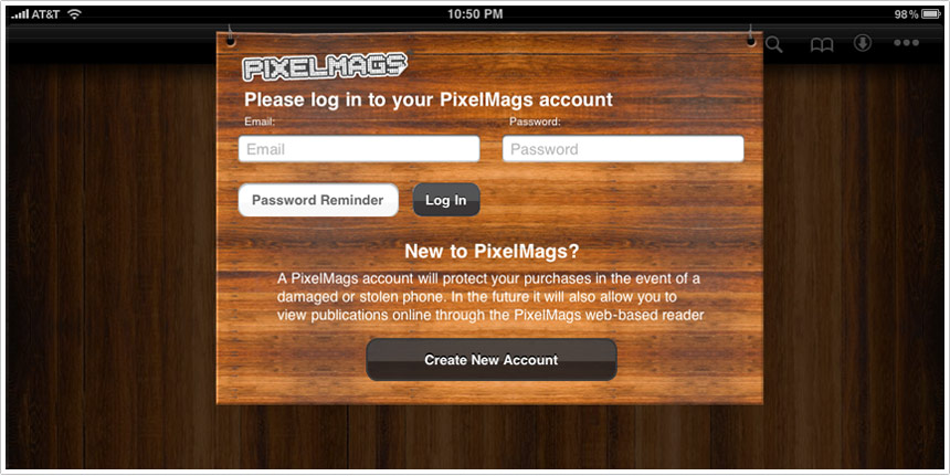
Imagine having to swipe your credit card before you can walk into a retail location. Imagine giving them your email address before picking up a catalog. That’s what Pottery Barn hopes you’ll do when you download their free iPad catalog app.
PixelMags may make a great catalog engine for iPad, or then again, they may not. I didn’t bother to create the mandatory account in order to find out.
Pottery Barn’s mistake is not in selecting a platform like PixelMags. Their mistake is requiring account creation as an entry-point for the experience. This needs to come almost last, just before a user orders something through the catalog.
Clearly business requirements trumped user requirements.
Add this to digg, del.icio.us, etc.
To most people I’ve encountered (outside the bay area tech scene) the iPad is a mysterious thing. The impression has been one of reluctant acceptance, as if individuals are unable to resist the accelerating march of technology. For instance, in a focus group, when asked about upgrading mobile phones I’ve heard something to the effect of “I don’t know what it does or what I could use it for but everyone’s getting them so I guess I will have to get one eventually.” And technology marches on. (and we keep our jobs).
The same thing is happening right now with the iPad. Despite the herculean efforts of Apple’s advertising, consumers are still asking “What is it for?” They cannot see it in their lives.
As an early adopter of the iPad, I believe it and other tablets will be integral parts of the mainstream computing experience but it’s difficult to explain this to consumers in casual conversations. I have explained that it is good for web browsing, games and watching videos (the same case advertisements are making) but I believe there is more to it than these basic software or feature-based use cases. The most important and valuable part of the iPad is its form. I’ll try to explain this more.
Continue Reading »
Add this to digg, del.icio.us, etc.
Hand selected news and ideas that stimulated discussion at Punchcut this week.
1_ More discussion of magazine apps for iPad. Tokyo web agency, iA, dissected the “designed for print, published to tablet” approach of the Wired iPad app. By contrast, the Popular Science iPad app excels because of it’s direct manipulation of content, we believe the approach is no doubt inspired by Berg’s Mag+ concept.
2_ A nice summary of the Info Display conference focused on touch technologies.
3_ The 2006 book every mobile and device UI designer should read, Everyware: The Dawning Age of Ubiquitous Computing
4_ HP CEO discusses WebOS as the primary driver behind the acquisition of Palm.
5_ Google’s Pac-Man burns $120M of work time, according to the BBC.
6_ And finally, two of mankind’s greatest inventions, together at last — an interesting exploration using velcro to put an iPad in different contexts.
Add this to digg, del.icio.us, etc.
Not all capacitive touch screens are equal. The impact of less accurate input may demand bigger hit targets and more space between onscreen keys/buttons. We’ve noted in the past the difficulty of UI elements that butt the edges of screens, it’s interesting to see that represented in this simple test.
The test below was put together by MOTO, a San Francisco based mobile development group. It’s a very simple, but highly illustrative test to check the accuracy of capacitive touchscreens. Could be a useful method before delving into that upcoming touchscreen interface.
And lest you think Apple has the corner on touchscreen accuracy, it’s interesting to note the differences in accuracy are a function of the materials and sensors (OEM hardware), not the OS/platform itself.
For other touch UI considerations read and watch Punchcut’s touch UI design considerations.
Add this to digg, del.icio.us, etc.
Of course you’ve already read or heard about Steve Jobs “Thoughts on Flash” this morning, putting to rest any rumormongering about Apple’s intentions.
Wired’s tweet this morning captured it in a nutshell, “Steve Jobs writes about his beef with Adobe Flash. Still a little unsatisfying.”
My take can be summed up simply. The evolution of mobile computing — especially the emergence of rich and ubiquitous mobile browsing — is forcing the web to keep up.
1- Adobe asked for this kind of response. The Adobe Flash evangelists and the attendant Flash community can only take jabs at Apple for so long before Apple squelches the whining with some hard realities (and some unnecessary jabs). Adobe has let Flash rest too long on web-based video delivery to carry the Flash platform. Despite lots of pioneering in mobile and on TV, the Flash platform has struggled to stick on non-PC devices. Jobs’ point about .H264 is right on in the mobile context. Which leads to a second point…
Continue Reading »
Add this to digg, del.icio.us, etc.
Punchcut will host AIGA San Francisco members for an evening studio tour. AIGA members will get a glimpse of Punchcut’s design process and a taste of designing for mobile and device interfaces.
Interested in attending? RSVP through the AIGA SF.
Punchcut
170 Maiden Lane, 3rd Floor, San Francisco, California 94108
Tuesday, 13 Apr 2010
6:00pm - 8:00pm
Add this to digg, del.icio.us, etc.