Context vs. Consistency
Posted in: Apple, Observations, User Interface 2, iPhone
The context versus consistency debate is not new, but it certainly doesn’t appear to be over. 37signals adds another argument to the context pile…
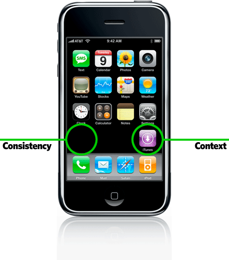
I read this interesting (short) article on 37signals.com concerning Apple’s placement of their new iTunes icon on the iPhone home screen. Given that the western world reads from left to right, users would expect this last icon to appear on the left side, right?… Not so says Apple, here’s why:
Read Context over Consistency at 37signals.com.
Although it’s something that the common person might not notice or ‘get’, it shows that the Apple UI folks are never asleep at the wheel and that they spend time thinking about the small details and their resulting implications. Don’t just do things automatically because tradition says we should or because the technology says it should be that way.
Return to: Context vs. Consistency
Social Web