Are you studying usability problems or looking for user preference?
When it comes to user research it’s important for everyone involved in the design process to have an understanding about the insights we can gain with a particular research approach. As interaction designers we look to user experience (UX) research to discover usability problems or barriers to the experiences we create. As stakeholders get involved in UX research, questions are sometimes introduced that are intended to uncover user preference instead of usability problems. This can profoundly affect research results.
Consider this scenario: You’re observing a UX research session for a media player interface. Your goals include determining if a user can create a playlist and manage a list of videos. The session is also set up to question which media player design the user likes most and to ask the user to rate the visual appeal of the design. Any cause for concern?
Shilpa Shah, Associate Director of Interaction Design at Punchcut, will discuss aspects of virtual connection (i.e. social networking) and the opportunity for mobile applications to enable and enhance real-world connections at Design For Mobile 2009.
The Conference will take place April 20 to 22 at the Eldridge Hotel in Lawrence, Kansas.
// SESSION TITLE
Thanks for the email, chat, post, wave, poke and tweet. Now can we grab a real drink?
// SESSION ABSTRACT
The mobile landscape is finally changing. With smartphone penetration at 20%, the phone’s promise as a mini portable computer is being realized and we are increasingly using phones to virtually connect, often choosing text instead of voice; Facebook or Twitter over email. But, as our virtual interactions increase, a greater value is concurrently being placed on our real, physical connections. The most compelling applications will be those which infuse the virtual realm into our physical environment, creating synergies for tangible experiences and exchanges.
As designers, we have the unique ability and responsibility to meet this growing desire and to design applications which will compel users to engage with their physical surroundings instead of escaping from the current reality.
There is much conversation in the interaction design world about the number of clicks required to perform a given task. There are usability teams out there with stop watches and video cameras timing how long it takes users to move through a flow. While these exercises are enlightening, they often miss the more critical question: how does a user feel about interacting with the UI? We have heard this enigmatic success criterion described as the whole “user experience”, but the this term doesn’t give much insight into how we might evaluate the value of an interface.
If we can’t measure the true value of an interface solely with clicks or milliseconds, how might we establish another criterion to evaluate the impact of a design? Fortunately interface design is not the first industry to deal with this question. Architecture, lettering and typography, industrial design, communication design and fashion all have practical and emotional impacts. These fields have relied on the study of aesthetics to help evaluate their work.
While aesthetic principles overlap from one design field to another, each discipline has its own vocabulary and emphasis. Below is a list of seven criteria to evaluate the aesthetic impact of a design. This is not a complete list, nor is it an easy recipe for good design. It does not replace user testing and research (I’ll share more thoughts on that later). However, it does give a framework to understand why users are reacting to a given design. Continue Reading »
A variety of devices currently on the market provide simple forms of touch feedback, but none is an unqualified success - they all lack some aspect of physical experience, a correspondence with the way we actually interact with the world. Current tactile solutions fall short either in reconfigurability or in pre-interaction feedback. This pre-interaction feedback would provide the physical feeling of a button which the user can press or not, rather than just a tactile confirmation that they have just pressed that button. Reconfigurability would allow physically felt controls to change with the content of the display. In short, it’s easy to make static physical buttons, but not to make them disappear when not needed. And it’s easy to provide a physical sensation after the user interacts, but not to provide buttons that can be physically felt *before* the interaction is committed.
Several tactile feedback solutions have been proposed, explored in concepts, and in some cases brought to market to try make tactile feedback more realistic.
PUBLISHER’S DESCRIPTION //Evernote for iPhone is part of the Evernote service, which is made up of desktop clients (Mac and Windows), a web version, and clients for other mobile devices. Whenever you add or edit a note in one version, it is quickly made available across all others, so that you can answer your notes and memories any time.
Of their broader service, Evernote says: Evernote allows you to easily capture information in any environment using whatever device or platform you find most convenient, and makes this information accessible and searchable at any time, from anywhere.
USER EXPERIENCE INNOVATION //Embrace the cloud. There are a handful of iPhone apps that let you create, edit and manage your text, audio and photographic notes. Evernote stands apart because of it syncs to an even more impressive desktop application. Evernote uses a “cloud” paradigm that performs impressively. Even photos and audio notes show up on the web or on your desktop version within seconds.
Notes are synced automatically. No need to press send or wonder if you left notes on your mobile. Deleted items get deleted across the cloud.
Doesn’t the Mac have notes apps as part of Mail app? Yes, it does, but they don’t sync. The best you can do with the built in Notes app is send a note as an email.
In case I haven’t been clear, the real power of Evernote is the access to the content in the form that’s most convenient in whatever context you’re in. Evernote has struck a nice balance of features between it’s mobile and desktop versions, not trying to cram everything into the mobile version, but not skimping on the tools that make it invaluable to use.
Editors’ note: We’ll be rounding up the noteworthy, novel and useful iPhone applications. While we hope our list is useful to you, we’re not necessarily trying to create the “best of” iPhone apps list. Our goal is to highlight iPhone (and iPod Touch) apps that solve UI problems in unique and interesting ways; solutions that add to the mobile device UI conversation or bring something new to the table.
PUBLISHER’S DESCRIPTION // Rhythm NewMedia, the leader in mobile video, unleashed vSNAX, the free iPhone video application… The application is available for iPhone and iTouch users, and features high quality video content from MTV, CBS, E!, and others. Users can access the latest videos on news, weather, gossip, fashion, or television show highlights as the app refreshes itself throughout the day.
USER EXPERIENCE INNOVATION // Delivering video to a mobile handset has been done, but not always well. The originality worth highlighting is the way vSNAX creates a nearly seamless viewing experience. Despite the limitations of pushing short video clips to a device, the UI allows users to continue to watch a clip while selecting the next clip they want to watch. Instead of presenting a list of similar videos, vSNAX let’s you slide through several options while you watch and hear the audio of your currently playing clip. The result is an experience that is most like an uninterrupted television viewing experience.
PRICE TO VALUE // It’s difficult to argue with free, especially when the content is from ABC, E! and MTV networks. I expect future versions will include basic features like saved favorites and history.
In March I posted HTC’s beautiful promotional video of the Touch Diamond UI. Now that the device is commercially available (in the UK for now) we can see the interface design in action. In a fairly in-depth video the mobile bloggers at TracyandMatt.co.uk run the UI through its paces.
The UI belies the Windows Mobile 6.1 OS underneath — it is nowhere apparent in HTC’s official video. But the problem isn’t necessarily Windows Mobile as the HTC UI does a great job at hiding it. The problem is the gaps they left in the Touch Diamond UI that let the Windows Mobile core UI poke through. The result is a disjointed experience as the user bounces between what seems like a solid, gestural and accelerometer-enabled touch experience and back to the basic and ugly Windows Mobile UI. As you can see from the video, there are clearly breakdowns in the experience where the new HTC UI behaves differently from the Windows Mobile underneath.
This is a case study of the fragmentation in the go-to-market (commercialization) process. The device manufacturers, the carriers and the operating systems come from different places with different motivations and business models. The parties involved are never fully able (despite what seems to be a really fantastic effort from HTC) to make that industry fragmentation invisible to users.
The video illustrates some of the noteworthy gaps in the user experience. Play by play after the bump…
This week at SXSW (pronounced South by Southwest) Jared Benson, Executive Creative Director at Punchcut, will lead a conversation titled “Mobile Manners: Mobile Presence and the Undefined Etiquette.”
Left to our own devices, what happens to our manners? Jared will lead a discussion among user experience design practitioners in discussing the profound effects the always-on mobile lifestyle is having on the way we interact with people and the world. In the same old contexts, we have a whole new set of choices: Do I really have to take this? Should I just put my headphones in and pretend I can’t hear them? Instead of calling mom back, can I text her? The cues and standards for how we communicate on our devices in the presence of others are just beginning to be defined. For the most part, individuals - not social norms - are deciding what is appropriate.
This conversation will cover what the UE design community can do to empower the user and alleviate the fear that we are becoming isolated by our technologies. Punchcut will facilitate a discussion on contextual considerations, the formality of various mediums, and the demands of emerging ideas like mobile presence.
Join the conversation at SXSW on Sunday March 9th at 5pm in Ballroom E.
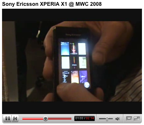
I’m discovering more and more that it’s not the user experience groups within the carriers and handset manufacturers that we need to convince about a new interface innovation; it’s the chipset manufacturers. While the vision and promise of a given UI might grease the necessary wheels of approvals to get an innovation to market, it rarely arrives without a degree of compromise.
Take the Sony XPERIA X1. In this highly-polished pitch video, the UI shucks and jives with all the agility of motion graphics at their finest. And sure, it works. For a UI that relies on a simple 3-view switcher to differentiate, it does make for a unique mobile experience. It certainly is more interesting than a lot of phone UIs out there. However, the actual device experience does lack in the speed department. The experience becomes even more painful when navigating the arched carousel, as demonstrated in this video.
Are companies hoping simple-minded consumers won’t notice these details? Unfortunately, in this example, an interesting UI transition has now become something that many users can’t help but notice — and wait for — every time they switch modes. Despite the fact that this is largely driven by the processor’s ability to push the objects around screen, this is the very stuff that perpetuates the stereotype that visual designers are all about gratuitous graphics at the cost of UI efficiency.
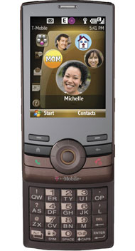
David Pogue, New York Times consumer tech writer, has written a candid article first praising and then trashing the T-Mobile Shadow.
Pogue outlines the newish environment created when T-Mobile and an ex-Apple designer partner to design a device with some great innovative features and then taken the third-party manufacturer (apparently HTC is the manufacturer, if ZDNet is correct) out of the picture and designed their own device; rethinking a few key features. The list of praise is impressive including a rethought click-wheel for scrolling plus directional buttons for up, down, left, right selections and a Blackberry Pearl style keypad licensed from RIM. But then, Pogue says, “you turn it on.” You see, its fatal mistake is it’s running Windows Mobile 6.


 David Pogue, New York Times consumer tech writer, has written a