Jun 29th, 2007
User Experience Critique:
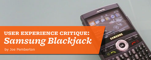
Samsung Blackjack
Carrier: AT&T (formerly Cingular)
Manufacturer: Samsung
Platform/OS: Windows Mobile 5
We can’t help the fact that mobile devices are often presented in retail environments with dummy mockups and fake printed screens. But, we can help the dialogue with a focus on the whole user experience and not merely a features and form factor breakdown.
The Blackjack is a conversation starter. It’s small, it’s capable and it’s good looking in a utilitarian kind of way. When people inevitably ask about it and I’m forced to explain my love/hate relationship with it.
For the good, the bad, the ugly, odd and puzzling keep reading after the bump.
The good
1 // A home screen that delivers
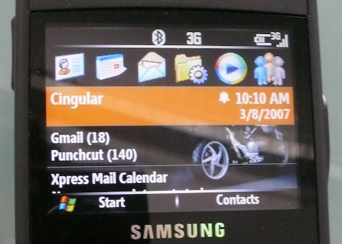
The BlackJack’s Windows Mobile home screen brings a lot of good, useful communications and reminders up to top of the phone. Beyond the usual — battery life, date, time, signal strength, (including whether you’re on Edge network or 3G) — the BlackJack indicates the numbers of unread text messages and unread emails from each email account. Calendar events for today and tomorrow are shown as well as your current “profile” (silent, outdoor, normal, etc). If you missed a call you’ll know it, and if you have new voicemails the quantity is shown.
This usefulness is enhanced by fairly immediate access; allowing you to select any given line to access the new communication. Select the SMS line to view your unread texts or select the voicemail line to dial voicemail, et cetera.
2 // Consistent keypad
This is smartphone territory and this device has a keypad configuration that standard phones do not. The implementation of the scroll wheel, return key, home key, enter key and 4-way rocker seem fairly consistent. The “end call” and the Windows Mobile “home” hard keys are often appropriately redundant and behave as one would expect. (If you are done with an application press “end call” and you’re back to the home screen, as if you’d pressed “home”.
Speaking in generalities, the QWERTY keypad rules. I can’t believe I used to have to triple tap everything before. The narrow (not as fat as a Palm, not as ugly as a BlackBerry, not as wide as a Sidekick) form factor with QWERTY was a major draw for me and it still lives up to its appeal. The dual number/letter approach took some getting used to, but after a week it was fairly natural. The one complaint I have is that I believe Palm’s approach to putting the number keys in a close cluster, with a contrasting color would’ve given me much less of a learning curve.
3 // IE + 3G = Happy
I know this crosses the boundary outside of user interface, but the speed of the 3G network combined with the quality of IE for Windows Mobile makes for a truly great mobile web experience. There are some problems with the way the browser history is handled, but otherwise, I have only good things to say about IE, the way it’s implemented in the Blackjack. In fact it’s so good that I often choose to use Google Maps from IE, rather than opening up the Google Map application (a free download from Google).
The bad
4 // The desktop metaphor doesn’t apply
My initial assumption was that the row of icons at the top of the home screen (see image) is not a set of the most common functions or applications, it is instead a set of the last 6 applications I’ve used; akin to a “recently used items” list. Multiple times I’ve found that when I want the browser (IE) or Media Player it’s not there because it’s been bumped out of the lineup by some less common application that I’ve used more recently.
This screen space is premium real estate and there it is, is reporting back to me my latest uses, rather than giving me access to the functions I consistently want most. This begs the question: what is more valuable consistency or access? The answer depends of course on context, but it seems clear that when it comes to a navigation paradigm that is persistent, consistency is more important.
5 // The Start Menu is a mess

As I mentioned earlier, the hub and spoke model with the Start menu as the hub is severely disfunctional. The home screen is hub-like, but in fairness should not be expected to be the hub.
The Start menu requires a lot of cleanup, but users don’t have that level of control. The Start menu is not a categorized list of options, like you might be familiar with on Windows for the desktop. Instead it is a folder view (an icon grid view). This grid has no apparent order to it (not alphabetized, not categorized). Some items are applications, some items are folders containing more applications. Other items are folders containing utilities.
To paint the picture for you, if my browser (IE) doesn’t happen to be in my last 6 applications, I must open the Start menu, which I hate doing. The Start menu is a long scrolling grid with 3 screens full of icons, 19 to be exact. Fully 7 clicks later I’ve finally launched IE. Ouch.
6 // Start menu mess is exacerbated by lack of groupings and poor naming
The BlackJack has some odd, puzzling, and at times frustrating lack of intuitive groupings and odd naming of features and options. Two examples. First, consider the “Event Manager” utility. Based on its name, and its location in the Start Menu, you’d think this was a calendaring or organization tool. Rather, it’s a utility for tracking incoming and outgoing network traffic. This is gearhead stuff that gets IT folks and engineers giddy, but it doesn’t belong at the top level of the Start menu.
The second example is the “Task Manager.” If you’re a Cingular employee you know to use this utility to turn off phone features and close apps to help grumpy customers preserve memory and therefore battery life. But if you’re a user, you probably think this is a to do list.
Both “event manager” and “task manager” are artifacts of an engineering-centric mindset, left over from an ancient operating system (DOS?) that has survived, cockroach-like, and made its way onto Windows Mobile devices.
7 // Nomenclature that lies
Saving preferences would benefit from better wording and clearer notification. It took me half a dozen times to figure out why my alarm was not set or why my profile settings were not saved. (Sure, you can blame me, the idiot user…) When changing a preference that is nested in a larger grouping of options, Windows Mobile uses a softkey labeled “Done” to confirm or save the change. So, I found myself going in and changing my backlight settings and pressing the Home key when I was done and finding that the change was not saved. Now that I understand this is tied to the way the OS handles application switching it makes more sense to me. My point is users should not have to be aware of the technical nuances. Pressing Home is the equivalent of leaving the app running in the background, as if you had done nothing to it. Indeed, it will be there, unsaved, just like you left it, if you go back to that app or utility later.
The word “Done” in this context is so purposeless that the user is ambivalent to it. If I’m really done, I’m going to hit “Home” and exit the application instead of a soft key and remain in the app. If the word were “Save” or “Confirm” it would correctly communicate the true actionable nature of that critical key and give the user needed clarity. By comparison, the RIM Blackberry handles this problem by throwing up a confirmation alert when changes are made before moving to another screen.
The ugly, odd and the puzzling
8 // The lonely delete key
Contrary to my priase of the keypad above, the delete key seems to have been forgotten. Frustratingly, it is not universally applied throughout the UI, as if some of the apps designers didn’t know it was there. The delete key works only when typing or texting. On many occasions I’ve found myself looking for a “clear” or “delete” key when reviewing my inbox and sorting MP3s or photos. Pressing the menu soft key and finding the delete option is tedious, mostly because the delete option has different priority in different contexts (see my comments on soft keys). This is an instance where the software design doesn’t take advantage of hard keys that are available. It is also another example of Microsoft trying to cleverly anticipate my usage, based on the application, rather than giving me a consistent rule to remember. Using the existing hard key would go a long way to mediate this.
9// The incongruities and annoyances
These examples below indicate to me a lack of centralized standards in the UI. It would appear that the contributing parties (Cingular, Samsung, MicroSoft, and Google as I’ll indicate) aren’t working from the same page on some of the very basic and core interface behaviors that should unify the interaction within a complex device.
Scrolling: how could something this basic be so inconsistently implemented? The key word in each of these is sometimes. “Sometimes” is not predictable to users.
- Sometimes lists have numbers letting you key in an item by number.
- Sometimes scrolling to the bottom of a list stops at the bottom of the list and does not bring you back up to the top.
- Sometimes a list will span multiple screens, yet each screen full requires selecting “More” to get to the next screen.
Soft Keys: Contextual access versus connsistency
Soft keys, you can’t live with ‘em. You can’t ignore ‘em, it seems. Inconsistencies with soft keys can move from simply annoying to crippling pretty quickly, and Windows Mobile 5 on the BlackJack strikes the usual sore spots.
Here the UI designers favored contextual access over consistency, and the result requires constantly hunting through soft key menus for the right option. The “Delete” option is number 1 in the messaging and email apps, but is number 6 in the media player and number 9 in the address book. Designing for context in this way, without considering the entirety of the devices features hinders the experience.
10 // Syncing (a Mac user rant)
Syncing is not really about synchronizing, it’s about integration into other aspects of my digital life — music, email, calendaring, bookmarks, etc. Users have a much higher expectation when you enter smartphone territory. I was optimistic about the integration with the Mac using a third-party application called “The Missing Sync” but that’s a topic for another review. In short, Missing Sync is a must if you run Macintosh OS, but don’t expect it to fully integrate seamlessly. Calendaring and contacts are handled well but you’ll be dragging MP3 files one by one in no time.
Music phone? Nope.
11 // Just because it plays music doesn’t mean it’s a music phone
One of the draws of this phone for me was the promise of large storage (2GB isn’t bad) and an open platform where I could side load music (instead of buying overpriced music I already own). So, when I got the Blackjack I decided to hang up my iPod and find out if I could cut out one device from my daily routine.
The first test was sound quality and there are 2 strong negatives here. First, the proprietary BlackJack headphones (not included with purchase) are just okay. They feel and sound cheap and I expected more for the $40 USD price tag and the cost of the device. The headphone jack is proprietary, so of course I can’t use my $50 Sony earbuds or my other $90 headphones. What a waste. Second is that often during playback — a few times during my 35 minute motorcycle commute — a song will cut out for a second. This might seem like a nit pick, but can you imagine putting up with this from a CD player or a dedicated MP3 player? Not a chance. I expect this has something to do with processor not being able to keep up, but smooth playback is a basic requirement for anybody looking to replace an iPod.
The second drawback is music management. Windows Media Player for mobile is severely hampered by the inability to create a playlist on the device since playlists are only imported from a Windows PC running Windows Media Player. (So of course it doesn’t play nice with Macintosh OS or with iTunes for Windows.) Even though I have a Windows install on my Intel-based Mac I am not going to switch to Windows Media Player just for BlackJack tunes.
Conclusion
I love the instant access to all the incoming communications I receive — voice, text, email, voicemail, web. I love how easy it is to compose a quick text. I love the fact that I don’t have to carry around my old iPod and my phone. I can’t live without 3G — my primary reason for not getting in line for an iPhone today. But — and the list of buts is long — I dislike how cumbersome it can be to switch between tasks. As with most mobile UIs, it follows a hub and spoke model, but as a hub, the start menu is severely disfunctional. The home screen is hub-like, but on its own it doesn’t hold up either.
I love the 2 gigabytes of storage I have, but I hate, nay loathe, how poor the music management is in every facet of the experience. Loading, managing playlists, listening are all somehow cumbersome.
So, Love it. Hate it. It’s the handsome, fast, connected, Blackjack that has some big UI problems once you get past the home screen. But, chances are — and this is what the old guards of the software industry are counting on — you’ll figure out how to use your device despite it’s flaws and use it happily for a long time to come… or at least for the next 18 months before they upgrade to a new phone.
6 Responses to “User Experience Critique:
Samsung Blackjack”
Leave a Reply
You must be logged in to post a comment.
Dude.. so, you missed the two most important things… The best of the best, and the worst of the worst:
The best - The scroll wheel menu! This is my “hub,” to use your nomenclature.. It’s perfectly customizable, and can be launched from any application by clicking and holding the scroll wheel. For me, that way overshadows the shortcomings of the “Start menu..” (I don’t know why they even call it that on WM..) There are a couple of other things to facilitate quick multitasking, including assigning the Task manager to the push-and-hold of the back button below the scroll wheel, and assigning apps to speed dial numbers.
The worst - No copy/paste/home/end/select all functions! Those five simple text editing functions probably comprise 25-35% of my computing time. Not having those features on a computing device is *extremely* disheartening and time-wasting. There is a 3rd party app, VitoCopyPaste, that helps take care of its namesake’s features.. but I haven’t found anything for the other three. Anyone else?
I never discovered the click and hold “scroll wheel menu”. I’ll have to pull out the BlackJack and look again. I do miss the scroll wheel on the iPhone. The iPhone’s scrolling is extremely intuitive, but its one drawback is it requires two-handed operation. The click-wheel made it much easier to browse the device while walking my dog and watering the yard.
I agree, the lack of copy/paste is severely lacking (as it is on the iPhone). It seems like the creators eliminate copy and paste when they decide you don’t need it since you’re not editing word processing documents. What they forget is that email is a form of word processing and that it would make email and web browsing much more seamless.
Just wanted to say, i really appreciate the time you put into the headers for your posts I don’t have a BlackJack so i wasn’t AS interested in the content, but damn if the post wasn’t beautiful.
Great critique - thanks! I’d like to add another frustration, and that has to do with the mail/calendar functions using Exchange server. I can accept meetings, but in my calendar I can’t see who’s attending, I can’t reply to the organizer, I can’t change my attendance response…
I guess as soon as the iPhone supports Exchange servers so I can get my coporate mail on it, I’ll be switching, but overall I’ve been reasonably happy with the BlackJack.
kool
Re-reading this a year later I have one observation: that Apple may be doing some things very well, but Apple is dealing with the same challenges on it’s cluttered home state. At least Windows Mobile has a functioning summarized view in the home state that has today’s iPhones all cluttered up.
Interesting link: The average iPhone user has downloaded 7.5 apps.