At last years’ JavaOne conference Sun Microsystems announced its entry into the presentation layer technology race. JavaFX Mobile will compete with Qualcomm’s uiOne, Adobe’s Flash Lite and Microsoft’s SilverLight.
From the AndroidGuys blog “…Earlier this week, Sun announced details for the forthcoming JavaFX Mobile and even demonstrated it with an Android prototype. Targeting multimedia phones, it will be part of a few planned JavaFX stacks due from the company. Typically, most phones running Java rely on the language for user-installed applications. For JavaFX Mobile however, it will have Java running behind everything from the user interface (UI) toolkit to the telephony, media, and browser software. Ideally, you’ll have the same experience with desktops, mobile devices, set-top boxes, and even automobile dashboards.”
Add this to digg, del.icio.us, etc.
Adobe’s investor relations call this week discussed the question of Flash for Apple’s iPhone. Get the inside information from Adobe’s Flash evangelist, Bill Perry.
Add this to digg, del.icio.us, etc.
I’m discovering more and more that it’s not the user experience groups within the carriers and handset manufacturers that we need to convince about a new interface innovation; it’s the chipset manufacturers. While the vision and promise of a given UI might grease the necessary wheels of approvals to get an innovation to market, it rarely arrives without a degree of compromise.
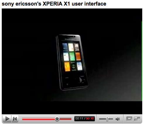
Take the Sony XPERIA X1. In this highly-polished pitch video, the UI shucks and jives with all the agility of motion graphics at their finest. And sure, it works. For a UI that relies on a simple 3-view switcher to differentiate, it does make for a unique mobile experience. It certainly is more interesting than a lot of phone UIs out there. However, the actual device experience does lack in the speed department. The experience becomes even more painful when navigating the arched carousel, as demonstrated in this video.
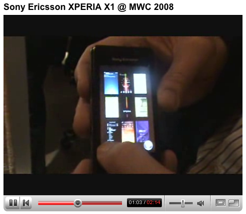
Are companies hoping simple-minded consumers won’t notice these details? Unfortunately, in this example, an interesting UI transition has now become something that many users can’t help but notice — and wait for — every time they switch modes. Despite the fact that this is largely driven by the processor’s ability to push the objects around screen, this is the very stuff that perpetuates the stereotype that visual designers are all about gratuitous graphics at the cost of UI efficiency.
Sony XPERIA, marketing video:
http://www.youtube.com/watch?v=Ay7RMHcUuGQ
Sony XPERIA, hands-on at 3GSM:
http://www.youtube.com/watch?v=wuo9CAZCbIE
http://www.youtube.com/watch?v=4wU5eiMR57s
Add this to digg, del.icio.us, etc.
Symbian seems to be in the first stage of grief over Android, Google’s new operating system for mobile. From an article by the BBC: “Google’s dominance of the web will not translate to the mobile phone market, a senior executive at Symbian has said.”
From the Symbian exec:
“About every three months this year there has been a mobile Linux initiative of some sort launched.
“It’s a bit like the common cold. It keeps coming round and then we go back to business. We don’t participate in these full stop. We make our own platform and we are focused on driving that into the mobile phone market at large ever more aggressively.”
And two paragraphs later:
“Meanwhile, the head of Nokia in the UK said the firm was in discussions with Google about using the platform.”
Read the BBC News article.
Link via Slashdot.
Add this to digg, del.icio.us, etc.
We only notice tectonic plates when enough tension gets released as an earthquake. (Yes, I’m in California, and yes we had a 5.3 the other day.) The trend toward openness and toward user choice is slow going, but we don’t feel it until someone makes a big announcement like Google’s this week.
The shift is happening. Apple’s iPhone launch was a big deal, proving that a device manufacturer can play first fiddle in the US mobile industry (and AT&T isn’t complaining that 40% of iPhone buyers are new subscribers) and more importantly, proving that a device’s user experience can lead every part of the conversation; within the industry and with consumers.
Google’s announcement feels like a corollary to Apple’s. It adds evidence that a non-carrier can wrangle support from across the mobile industry (handset and chip OEMs, carriers, platform developers) to create an open platform.
Google’s announcement has interesting possibilities. What will device manufacturers come up with if they don’t have to pay Microsoft (or anybody else) for their OS? What will the carriers create if they didn’t have to pick from the pros and cons of the various OSs, but if they had the ability to write their own branded UI for a line of devices? What will the third party application developers be able to do with a more open, internet-powered approach (as is starting to happen on the Apple front, but that’s another debate.) What will content providers create for users if Google can prove an ad-subsidized mobile model will work?
Someday we’ll all look back and remember how cute Google was when it was just a little rainbow logo search field staring at you from a blank page.
Add this to digg, del.icio.us, etc.
1// Picturephoning has an interesting write-up on “unauthorized” use of mobile phones by students in classrooms with plenty of YouTube evidence to back it up.
2// At Punchcut we’ve been calling it the new convergence (where convergence is no longer a move to a single, mega-device, but a broad move toward ubiquitous data availability across devices and media), but Mike Mace is calling it the information ecosystem. Whatever you call it, Mike shares an interesting perspective: “The rise of the information ecosystem: How mobile devices, personal computing, media, and the Internet all fit together.
3// Cingular (AT&T) is the second carrier to adopt Qualcomm’s mobile broadcast TV platform MediaFLO.
4// Microsoft announces Windows Mobile 6 at 3GSM.
5// Wired features a quick look at the smartphone lineup that was announced at 3GSM this week.
6// In non-phone device news, a cadre of music execs are busy creating the next gen MP3 player.
7// Finally! Bluetooth headphones worthy of audiophiles.
8// Bank of America Mobile to let users check their accounts, pay bills and transfer funds.
9// Business Week analyzes the timing of a Virgin Mobile USA IPO. It’s an interesting run-down of the US prepaid wireless market with Virgin’s competition from MVNOs Boost, Amp’d and Helio.
10// The “fourth screen”, as the film industry has dubbed it, had an interesting submission from Sundance that debuted at 3GSM. BBC Quote: “Jonathan Dayton and Valerie Faris’s A Slip In Time is one of six shorts made especially for mobiles as part of the Sundance Film Festival Global Short Film Project, and screened at the 3GSM Mobile Phone conference in Barcelona this week.”
Add this to digg, del.icio.us, etc.
The best mobile news and discussions for the week of 19 January, 2007.
Culture of Mobility
1// Mayor Bloomberg announced that New York will soon allow 911 (and 311) to accept digital photos and videos.
“If you see a crime in progress or a dangerous building condition, you’ll be able to transmit images to 911, or online to nyc.gov,�? the mayor said in his annual State of the City address. “And we’ll start extending the same technology to 311 to allow New Yorkers to step forward and document nonemergency quality of life concerns, holding city agencies accountable for correcting them quickly and efficiently.�?
2// Book, I hot mod balk. (a.k.a - Cool, I got one call.)
Kottke.org has a mention of kids in the UK using “book” as a synonym for “cool.” It’s rooted in a T9onym where the word cool and the word book both come up when you enter 2665 on a T9 keypad.
3// In the clamor of the Apple Keynote, Nokia and Visa’s announcement of mobile Visa payments in the US snuck under the radar.
Mobile technology news
4// Mainstream press picks up on Qualcomm: BusinessWeek has a feature on emerging mobile technologies primarily mentioning Qualcomm’s mobile TV offering, MediaFLO.
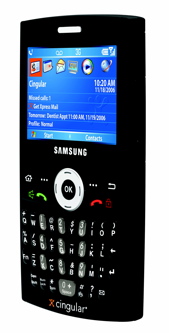 5// Mobileburn has a review of Samsung + Cingular’s latest sleek little smartphone — the BlackJack, a Windows Mobile handset that is slightly smaller than Motorola’s popular Q. Being skeptical about Samsung handsets doesn’t mean I don’t want one. Did I mention it’s black?
Mobile UI
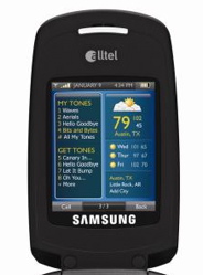 6// Looks like Alltel is doing the widgets thing.
7// Mike Krisher has an interesting piece on FlashLite.
8// Mike Rowehl on Rails Dev for the Mobile web: Rails and Mobile Content
Add this to digg, del.icio.us, etc.
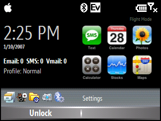 Got Windows Mobile? Don’t fret, you can be cool like Steve Jobs too.
If you’re like me, perhaps you bought that Motorola Q for its slim form factor, only to find that you no longer have the sveltest handset on the market anymore. Well look no further; you don’t have to switch to Cingular in June after all. Simply enable this handy iPhone theme on your Q (or brand new Q Pro) and be the envy of all.
Before you get your hopes up, those nifty icons are just for decoration. Its Windows Mobile; you didn’t actually expect them to work, did you?
The theme does provide one-click access to your messaging options. [Not available for download.]
Add this to digg, del.icio.us, etc.


 Got Windows Mobile? Don’t fret, you can be cool like Steve Jobs too.