Mar 13th, 2009
FedExâs Counterintuitive Device Design
FedEx Courier: Sign here.
Me: Sure. And hey, do you mind showing me how that device works?

FedEx Courier: This thing? I hate this thing.
She was clearly surprised that I would ask and even eager to show me how painful this part of her job was.
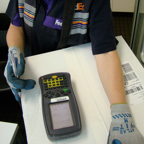
The UI is decidedly utilitarian, which seems appropriate for an enterprise focused device. A one-bit display with text and buttons, a stylus for input and enough keys to make a TV remote jealous. (If you look closely the keypad is ABCDE, not QWERTY.) Pretty basic. She then told me all the cumbersome problems; using the menus, operating with the stylus while wearing gloves, and poor contrast in sunlight.
Then the worst part. The device is too clever for its own good. The interface is oriented to the courier, with the keys at the bottom and the screen at the top. Then when the courier taps to indicate that sheâs ready for the signature the interface flips 180 degrees. She presents it to people and they inevitably want to turn the device around to face them, which means the UI is now upside down.
Instead of saving time, the clever re-orientation takes more time.
Web favorites
- Casino Europei On Line
- Casino Sites Not On Gamstop
- Gambling Sites Not On Gamstop
- Betting Sites UK
- Casino Not On Gamstop
- Casinos Not On Gamstop
- Best Online Casino Canada
- Non Gamstop Casino Sites UK
- Sites Not On Gamstop
- Non Gamstop Casinos UK
- Non Gamstop Casinos
- Slots Not On Gamstop
- Best Non Gamstop Casinos
- UK Casino Not On Gamstop
- Gambling Sites Not On Gamstop
- Slots Not On Gamstop
- Non Gamstop Casinos UK
- Meilleur Casino En Ligne France
- Beste Online Casino Nederland
- Best Non Gamstop Casinos
- Non Gamstop Casino
- Betting Sites UK
- Casino Non Aams Italia
- Casino Online Non Aams
- UK Casino Not On Gamstop
- Casino Online
- Casino En Ligne Belgique
- Meilleur Site De Casino En Ligne Belgique
- Siti Scommesse Non Aams
- 파워볼사이트
- オンラインカジノ ライブ
- плинко
- Cresus Casino Interdit En France
- Casino En Ligne Fiable
- Siti Di Scommesse Non Aams
- 仮想通貨カジノ おすすめ
- Casino En Ligne France
- Casino En Ligne Français
- Casino Non Aams
- Bonus Casino En Ligne
One Response to “FedExâs Counterintuitive Device Design”
Leave a Reply
You must be logged in to post a comment.

[...] post about FedEx courier devices was just brilliant. Iâve often wondered about these onerous-looking contraptions, and how [...]