 Shilpa Shah, Associate Director of Interaction Design at Punchcut, will discuss aspects of virtual connection (i.e. social networking) and the opportunity for mobile applications to enable and enhance real-world connections at Design For Mobile 2009.
The Conference will take place April 20 to 22 at the Eldridge Hotel in Lawrence, Kansas.
// SESSION TITLE
Thanks for the email, chat, post, wave, poke and tweet. Now can we grab a real drink?
// SESSION ABSTRACT
The mobile landscape is finally changing. With smartphone penetration at 20%, the phone’s promise as a mini portable computer is being realized and we are increasingly using phones to virtually connect, often choosing text instead of voice; Facebook or Twitter over email. But, as our virtual interactions increase, a greater value is concurrently being placed on our real, physical connections. The most compelling applications will be those which infuse the virtual realm into our physical environment, creating synergies for tangible experiences and exchanges.
As designers, we have the unique ability and responsibility to meet this growing desire and to design applications which will compel users to engage with their physical surroundings instead of escaping from the current reality.
Continue Reading »
Add this to digg, del.icio.us, etc.
While watching this we invite you to imagine Gabriel White’s alluring and smart Australian accent explaining to you the language and affordances of gestural UI (slide 17-21). When SXSW releases the audio we’ll link it up here. Until then, here’s an overview to accompany the slides.
Where’s the opportunity? Sensors are in place for incorporating gestures in a variety of devices and use cases but there may be a tendency to add them simply because you can. We gently remind designers; just because you can, doesn’t mean you should. The opportunity (and the challenge) for designers is to write the rules of gestural UI and Gabe has puts forward several guiding questions to help designers ensure gestures add meaning and possibly the right level of fun to the device experience.
One key example is shaking. The Sansa Shaker music player (slide 40) needs no screen; the device’s shape invites users to shake it. The mental model of shaking the device to randomly rearrange songs in a play list comes readily. UrbanSpoon’s iPhone app (slide 43) extends the metaphor appropriately, letting users randomize the search results of local restaurants. Then the examples get more tenuous. A gesture like shaking can quickly degrade in value, and even detract from an experience as it gets loosely translated. Applications like FaceBook for iPhone (slide 44) let you shake to refresh your friend feed — not something that fits the mental model of randomizing or shuffling. Then mCoolPhone (slide 46) fully breaks the model by letting you to shake to answer a voice call.
Guiding Questions for Gestural UI Design:
1- What’s the metaphor?
2- What are the affordances?
3- Is the application specialist or generalist?
4- How can I use gesture to disambiguate?
Add this to digg, del.icio.us, etc.
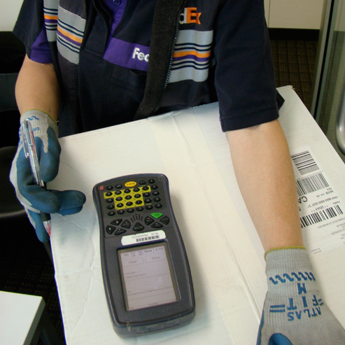
FedEx Courier: Sign here.
Me: Sure. And hey, do you mind showing me how that device works?

FedEx Courier: This thing? I hate this thing.
She was clearly surprised that I would ask and even eager to show me how painful this part of her job was.
The UI is decidedly utilitarian, which seems appropriate for an enterprise focused device. A one-bit display with text and buttons, a stylus for input and enough keys to make a TV remote jealous. (If you look closely the keypad is ABCDE, not QWERTY.) Pretty basic. She then told me all the cumbersome problems; using the menus, operating with the stylus while wearing gloves, and poor contrast in sunlight.
Then the worst part. The device is too clever for its own good. The interface is oriented to the courier, with the keys at the bottom and the screen at the top. Then when the courier taps to indicate that she’s ready for the signature the interface flips 180 degrees. She presents it to people and they inevitably want to turn the device around to face them, which means the UI is now upside down.
Instead of saving time, the clever re-orientation takes more time.
Add this to digg, del.icio.us, etc.
In case you’ve not had time to follow the backchannel chatter, we’ve gathered some of the mobile user experience articles from the last few days that caught our eye. Here’s some quick recommending reading that describes our changing digital lifestyles, mobile trends, future tech considerations, and there’s even a good robot story thrown in for good measure.
If you’ve come across a great mobile user experience story in the last few days, let us know! Post it in comments or find me on Twitter: http://www.twitter.com/benson/
Trends
MWC’09 Trends by John Strand
http://www.mocom2020.com/2009/03/key-trends-mobile-word-congress/
Vision Mobile’s Mobile Megatrends 2009
http://www.visionmobile.com/blog/2009/02/mobile-megatrends-2009/
Design Exploration
New Tab Page: Proposed design principles and prototype (Mozilla Labs)
http://labs.mozilla.com/2009/03/new-tab-page-proposed-design-principles-and-prototype/
iPhone prototype caught on video
http://www.engadget.com/2009/03/10/iphone-prototype-caught-on-video
IPTV
The future of TV lies on the net
http://news.bbc.co.uk/2/hi/technology/7932278.stm
Digital Media newsletter (PDF)
http://www.digital-media.net.au/Common/ContentManagement/digital-media/newsletter/20090309.pdf
Internet Protocol TV (IPTV) is coming, cable companies better adopt to changing times
http://controlaltdelete.tv/2009/03/08/internet-protocol-tv-iptv-is-coming-cable-companies-better-adopt-to-changing-times/
ZillionTV
http://www.zilliontv.tv/
Mobile TV Popular In Korea, Not Making Any Money
http://www.youth-marketing-statistics.com/2008/12/mobile-tv-popular-in-korea-not-making.html
Emerging Technology
Charging mobile devices wirelessly: eZone by Qualcomm
http://www.mocom2020.com/2009/03/the-ease-of-charging-your-mobile-devices/
Wintek to supply touch panels for Apple netbook, says paper
http://www.digitimes.com/news/a20090309PB204.html
Philips: OLED windows in a few years
http://www.techradar.com/news/world-of-tech/philips-oled-windows-in-a-few-years-570698
Japanese gadget controls iPod in blink of an eye
http://www.physorg.com/news155728914.html
Robot Programmed to Love Goes too Far
http://www.muckflash.com/?p=200
Experimental Multitouch UI for Nokia S60
http://www.symbian-freak.com/news/009/03/experimental_multitouc_interface_for_5800.htm
Social Networking
Social Networking More Popular Than Email, More Profitable Than…Er…Um
http://digitaldaily.allthingsd.com/20090309/social-networking-more-popular-than-e-mail-more-profitable-than-er-um/?mod=ATD_rss
When Everyone’s a Friend, Is Anything Private?
http://voices.allthingsd.com/20090309/when-everyone%E2%80%99s-a-friend-is-anything-private/
General News
Internet, Mobile Phones Named Most Important Inventions
http://www.nytimes.com/2009/03/08/business/08count.html?_r=1
Chinese political advisor urges innovation to tackle downturn, emphasis on creative
http://english.people.com.cn/90001/90776/90785/6608793.html
Charlie Rose: A conversation with Marissa Mayer, V.P. of Search Product and User Experience, Google
http://www.charlierose.com/view/interview/10129
Recession Forcing Automakers To Think About Mobile
http://www.mobilemarketingwatch.com/recession-forcing-automakers-to-think-about-mobile/
Why we’ve reached the end of the camera megapixel race
http://arstechnica.com/gadgets/news/2009/03/why-weve-reached-the-end-of-the-camera-megapixel-race.ars
Add this to digg, del.icio.us, etc.

Gestures are simply the way we interact with the natural world. Gabriel White, Punchcut’s Interaction Design Director will give a talk titled “Gestural UI: iPhone Taught Us Flick and Pinch. What’s Next?” at SXSW Interactive in Austin.
The Conference will take place March 13 to 17 in Austin, Texas.
// SESSION ABSTRACT
Gestures are simply the way we interact with the natural world. How can designers translate gestures into meaningful, engaging interactions with handheld devices? The talk will discuss current and emerging technologies like near field communications, proximity, accelerometer, and others. White will propose design principles that create fun experiences and deeper connections with users.
Continue Reading »
Add this to digg, del.icio.us, etc.
 Shilpa Shah, Associate Director of Interaction Design at Punchcut, will discuss aspects of virtual connection (i.e. social networking) and the opportunity for mobile applications to enable and enhance real-world connections at Design For Mobile 2009.

