Convergent Experiences, Divergent Devices
Posted in: Mobile Culture, Observations
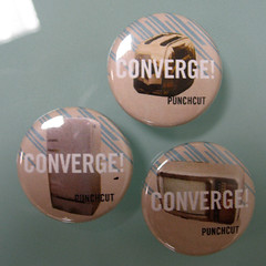
 Convergence is sometimes viewed as the consolidation of multiple technologies towards a singular über-device. I prefer to view convergence as the tendency of technologies, as they grow in complexity and scope, to overlap and consolidate functions. Convergence is a trend wherein devices and functions take on commonly shared traits, but this doesn’t mean that this trend ultimately ends with a single, multi-functional mega-device, no matter how cool and ‘mad scientist’ that might sound. Product mobility, technical innovation, component obsolescence, and proprietary ownership of certain functions are among the many forces that will ensure we continue to interact with ecosystems of related and overlapping devices rather than a single device with every function built in.
But, convergence as a concept illustrates how interaction design for devices is changing. As our devices advance, they are often consolidating functions previously reserved for separate devices. Examples of this can be seen in most modern devices, from mobile phones (which serve as PDAs, calculators, mini-computers, and portable game consoles as well as communication devices) to Media Center PCs (which serve as DVR, stereo music player, and digital picture frame as well as a standard personal computer).
With all this in mind, I’m offering up 7 considerations to use when designing interactions for converged devices.
7 Considerations for Convergence
1 // Our devices are an ecosystem. This ecosystem should function without codependence. That is, devices should interoperate smoothly, but the addition or removal of a device should not disrupt the ecosystem. Adding your new DVR shouldn’t break your ability to use your cable box.
2 // Design for reasonable consistency. Consistent UI behavior and appearance should be the rule among related devices, but understand key differences between devices and accommodate those aspects unique to a given device or function. When playing MP3s on a mobile phone, it is more important that the controls work intuitively than that they overlap functionally or visually with the controls for watching a video.
3 // For users, content drives convergence. Content (whether TV shows, family photos, or contact data) is the fundamental element that users value. We expect to access the same content, OUR content, in multiple settings and contexts. Devices that grant users a feeling of control over content are instantly appealing. For example, the ability to access the same contact data with multiple devices or functions (mobile phone, PC, social networking websites, etc.) provides a distinct convenience to users.
4 // Intelligent discovery encourages adoption. To successfully lead users to new content, we must provide enticing and targeted means of content discovery. Discovery methods should never interfere with the use of existing content, but should delight users who are ‘browsing’. Discovery should leverage users’ own social networks and other available data to provide more targeted results.
5 // Don’t burden users with content formats, formatting and packaging of content. Though content must generally be formatted for each device that plays it, try to design so systems interoperate seamlessly and things just work. Non-DRMed MP3 files are desirable not just for sharing with others, but because they are so portable between the user’s own PC, music players, phone, and even game consoles.
6 // Context, not just content, is king. Our devices extend our abilities, and should serve and enhance our adaptability, wherever we find ourselves. Location, time and social factors all contribute to our contexts. Receiving a phone call while driving differs substantially from taking a call from a desk, and the data displayed should also be different. Devices should have greater understanding of context, and display the appropriate level of detail at the appropriate time and place.
7 // Redundancy is useful. Devices should provide users with more than one means to achieve a goal. This allows users to find their own way, and to form their own mental map of the device. This doesn’t mean all possible avenues must be built: judicious user research and testing can suggest the 2-3 most expected means to an end. If there are three ways for a user to get to their favorite song, the chances are greater that they will get there quickly and happily. There’s nothing wrong with that kind of redundancy.
What considerations you would add to this list?
Return to: Convergent Experiences, Divergent Devices
Social Web